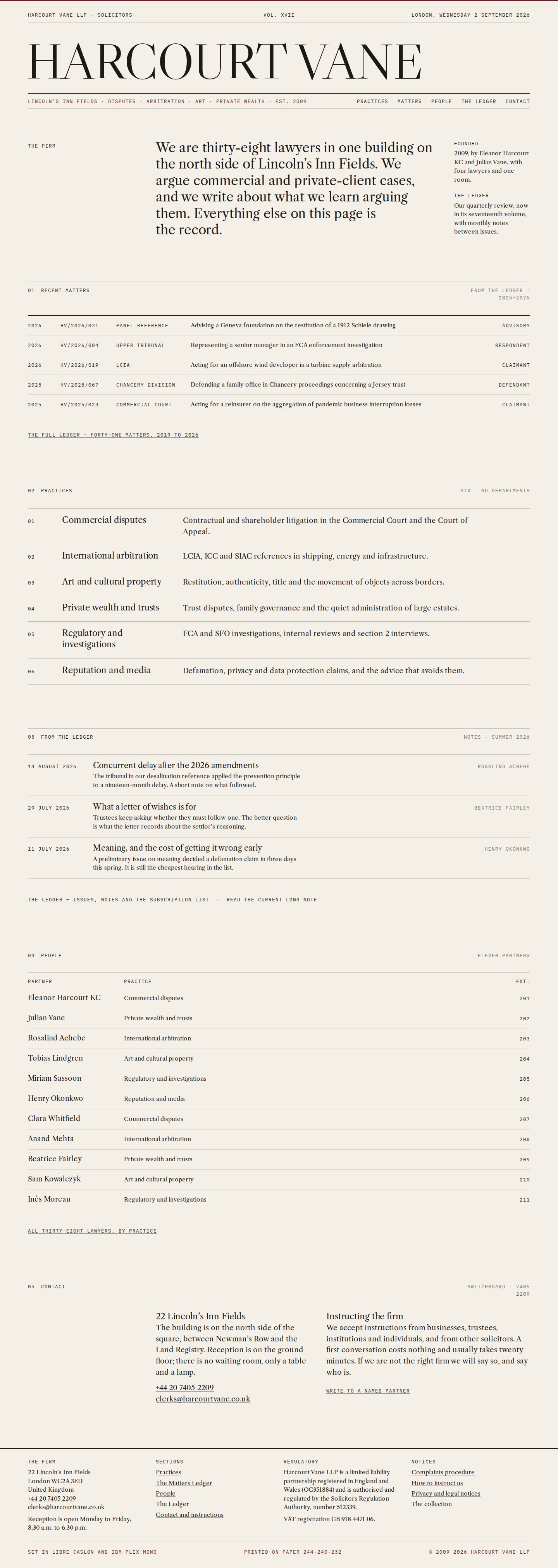
Harcourt Vane
A London disputes firm that publishes. No hero image, three colours, two Caslons and a ledger of matters. The discipline piece of the collection.
- Client
- Harcourt Vane LLP, Lincoln’s Inn Fields
- Sector
- Legal services
- Scope
- Site, practices, people, the Matters Ledger, The Ledger publication, contact
- Year
- 2026
- Stack
- Vite · CSS grid · vanilla JS · no animation library
Serious rather than large.
Harcourt Vane is a firm of thirty-eight lawyers at Lincoln’s Inn Fields, founded in 2009 by Eleanor Harcourt KC and Julian Vane. It acts in commercial disputes, international arbitration, art and cultural property, private wealth, regulatory matters and reputation. It publishes a quarterly review, The Ledger, and monthly notes, and it cites its sources.
The voice is precise, dry and occasionally witty. Sentences are short. Nothing is sold.
Avoid every law-firm cliché and still look like a law firm.
The genre is exhausted: a skyline, a handshake, a navy gradient, a grid of practice areas with icons. General counsel and family-office principals see through all of it. The brief was to make them feel they had found the firm that reads more than it advertises, and to send enquiries to named partners rather than a form.
The constraint was self-imposed: no imagery to speak of, no motion to speak of. The typography, the grid and the rhythm had to do everything.
Paper, ink, one oxblood rule.
The site is composed like a periodical. A masthead, running heads in mono, hairline rules structuring the page like a broadsheet, a reading column of sixty-odd characters, marginalia in the outer columns. Libre Caslon Display sets the masthead and headlines; Libre Caslon Text carries the reading; IBM Plex Mono carries matter numbers, dates and labels.
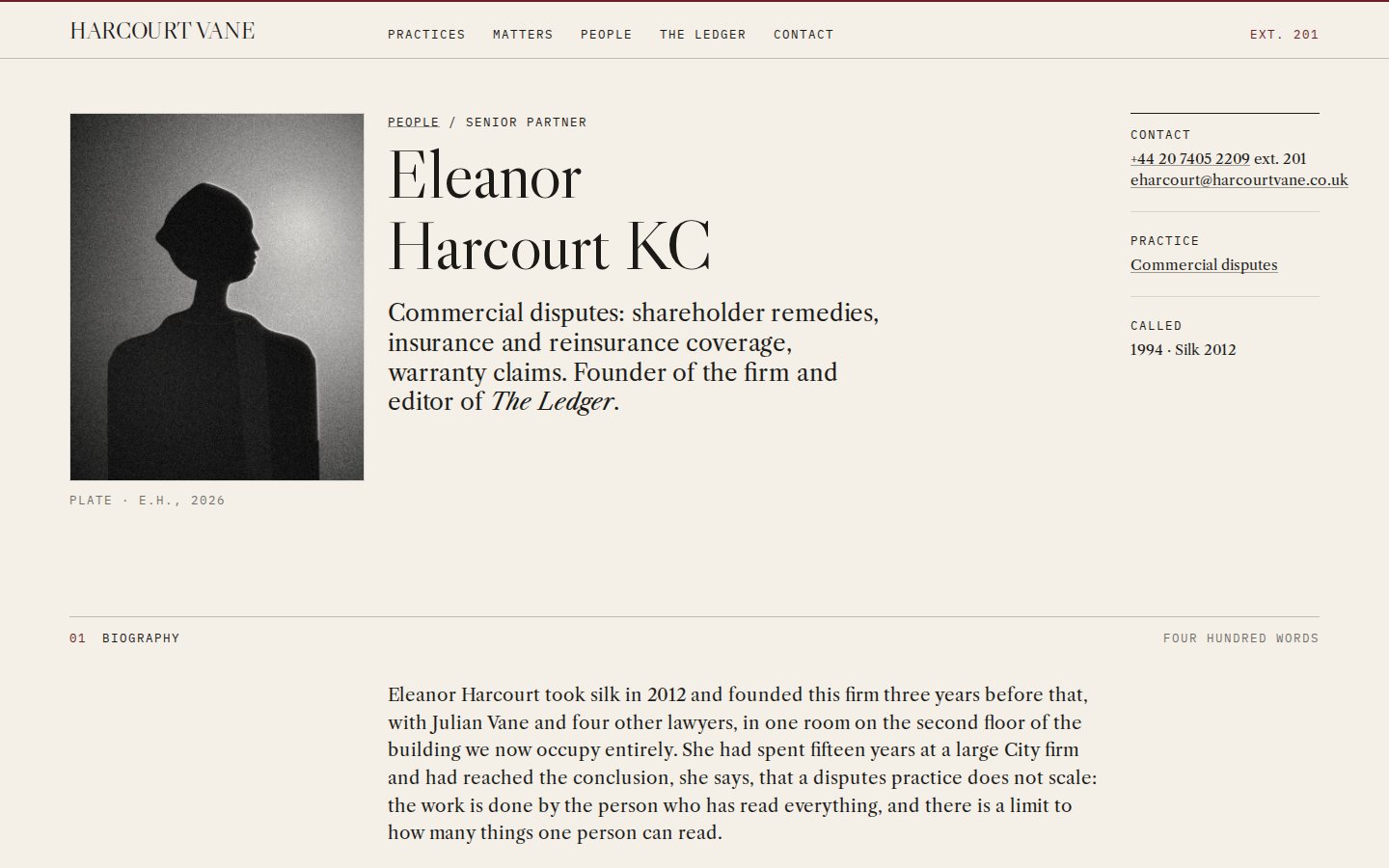
Oxblood appears as a single rule, a selected row, a link on hover. It is never a fill. Partner portraits are hard-side-lit silhouettes rendered in canvas, never faked faces; each practice has one black-and-white still with heavy grain.
Built for people who read.
The home page is an issue: masthead, an editorial statement, recent matters, the six practices as a numbered list, the latest notes, the partners as a text list with telephone extensions. Practice pages are essays. People pages are dense lists grouped by practice. The Ledger is a real publication index with issues and a subscription.
Every element that would normally be a card is a row. Every button is text with a rule above and below.
The Matters Ledger, and footnotes that answer in the margin.
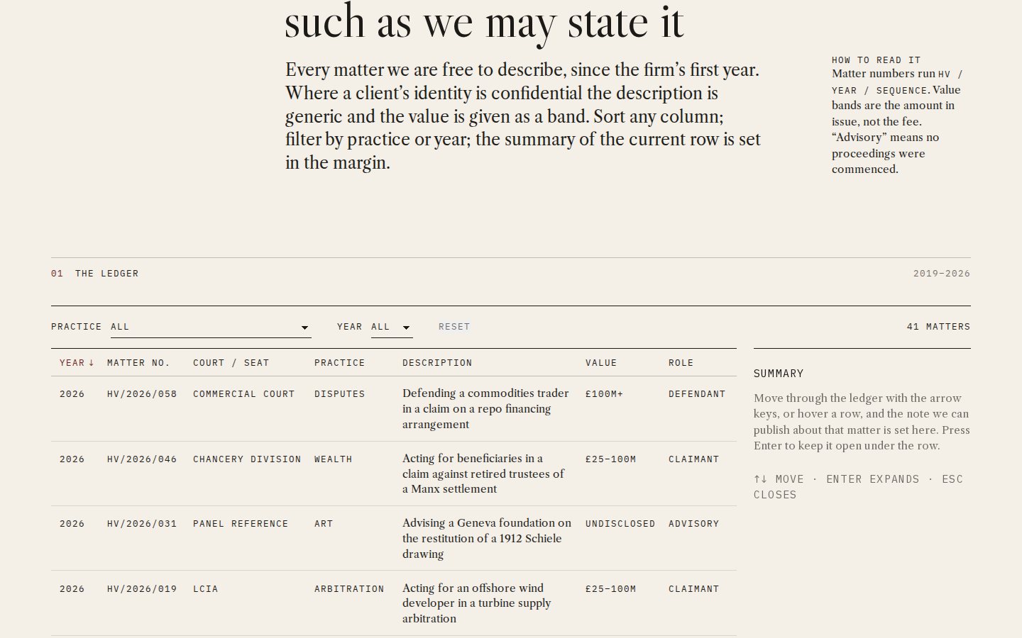
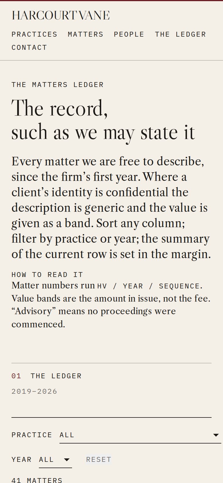
Forty matters are laid out as a court list: year, matter number, court or seat, practice, a one-line description, value band, role. Columns sort, a small mono control row filters by practice and year, and rows settle with a sixty-millisecond stagger. Hovering or focusing a row reveals a two-sentence summary in the right margin; on mobile it expands inline. Arrow keys move the highlight and Enter expands.
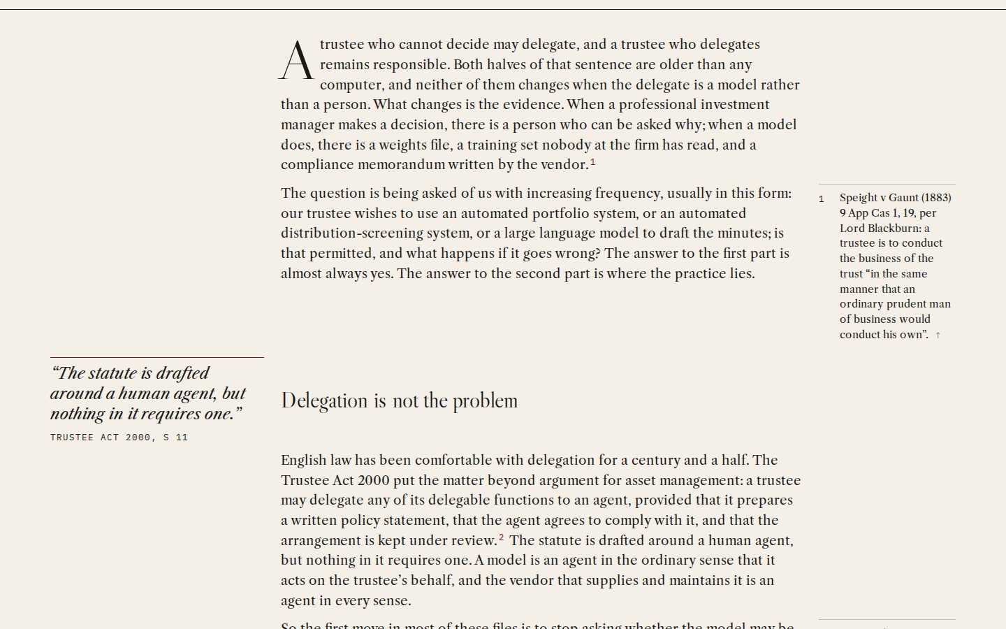
In the long-form article, superscript footnote marks are anchored: on desktop the footnote highlights in the margin column, on mobile it slides open beneath the paragraph. Both interactions are quiet. Both are exact.
 Open the live site
The Matters Ledger with a margin summary
Almost none, on purpose.
Link underlines draw in 180 milliseconds. Rows settle. A page transition is a paper-coloured wipe of a third of a second. Headings do not animate and nothing parallaxes. The absence is the point: a designer who can only impress through effects is not demonstrating design.
Grid, measure, rhythm.
There is no animation library on the page. The ledger is a table with client-side sorting and filtering in vanilla JavaScript and full keyboard support. The footnote system is a few dozen lines of code and a lot of care in the grid. Portraits and stills were generated in canvas and rendered to grain-treated rasters in the repository.
Desktop and mobile.
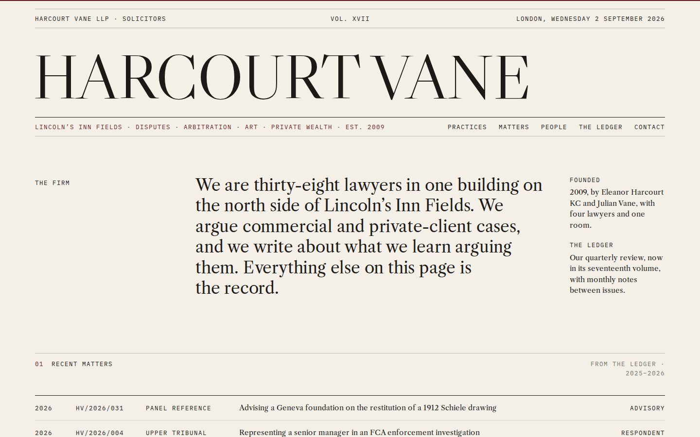
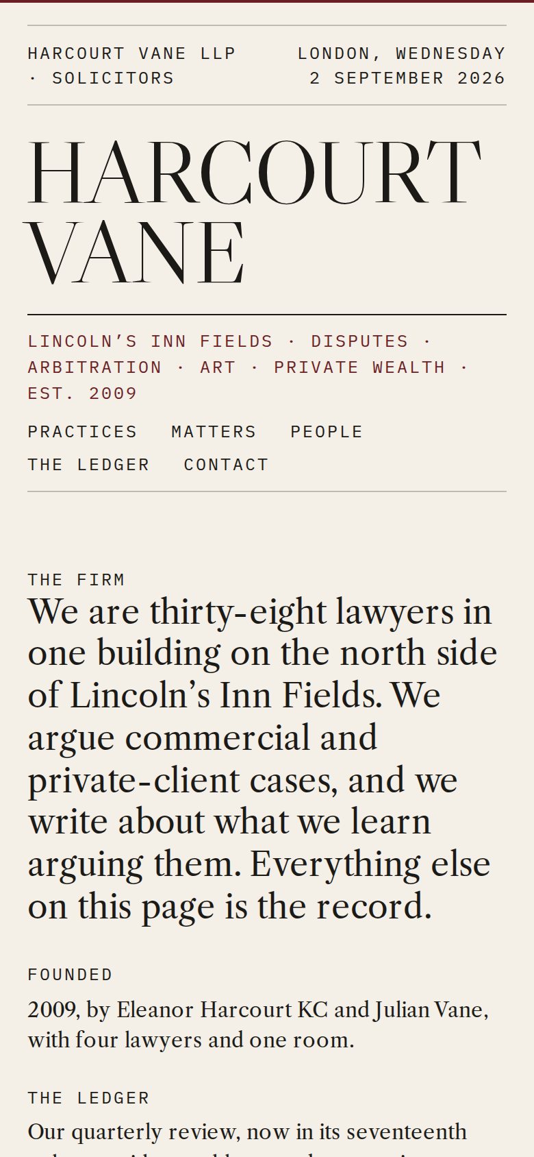
Screens captured from the built site at 1440 and 390 pixels wide.
 Open the live site
 Open the live site Open the live site
 Open the live site
 Open the live site
 Open the live site
Home: the masthead · Home at 390 · The Matters Ledger with a margin summary · Long-form article with footnotes · Partner profile · The ledger on mobile
Hold the page still, and make it beautiful.
The finished site looks better at 390 pixels wide than most sites look at 1440, which was the test. It demonstrates that maturity is knowing when not to move.