Northline
An ethical recruiter for nurses and doctors moving continents. The eligibility check became a conversation that draws your route.
- Client
- Northline Health Careers, Manchester · Manila · Nairobi
- Sector
- Immigration and international recruitment
- Scope
- Site, eligibility journey, destination explorer, vacancies, employer proposition, stories, assistant
- Year
- 2026
- Stack
- Vite · GSAP Flip · SVG · rules engine · local knowledge base
No candidate fees, ever. That is the whole brand.
Northline places nurses, doctors, radiographers, midwives and care staff from the Philippines, India, Kenya and Nigeria into hospitals in Canada, Ireland, Germany, Australia and the UAE. It was founded in 2018 by a former NHS director of nursing and a former Philippine overseas-employment adviser, is a signatory to the WHO code of practice, and has never charged a candidate.
Its voice is direct and warm and honest about how hard the process is. It speaks to the candidate as an equal and never sells a dream.
Two audiences in opposite emotional states.
Candidates arrive hopeful and wary of scams. Hospital HR directors arrive procurement-minded and allergic to risk. The same site had to reassure both without becoming corporate for one or sentimental for the other.
The conversion for candidates is a completed eligibility assessment and a booked call. The conversion for employers is a request for a proposal. Both had to be reachable within seconds of arriving, on a phone, on a slow connection.
Warm documentary, without a single corporate blue.
Deep spruce green does the work that blue does on every competitor: it means go, it means calm, it means institutional. Unbleached paper carries the reading surface. Terracotta is reserved for human moments and the primary action so that it still means something when it appears.
Newsreader sets the headlines with an italic doing the emotional work in each one. Schibsted Grotesk carries the interface. Imagery follows one direction, natural window light and people at work, rendered as back-lit figures, hands and places rather than faked faces.
A route, not a form.
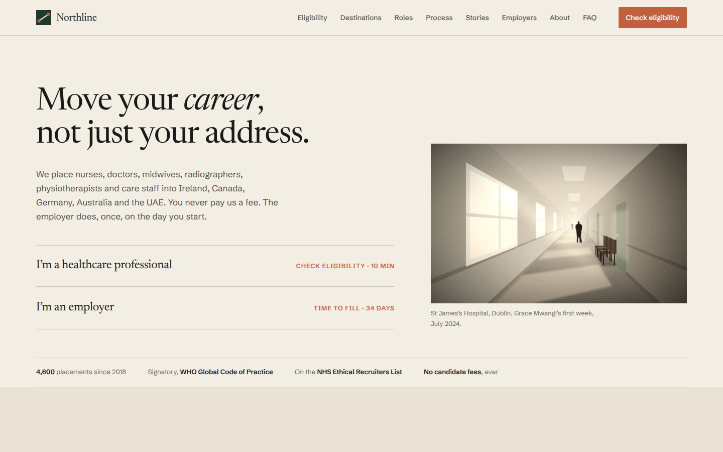
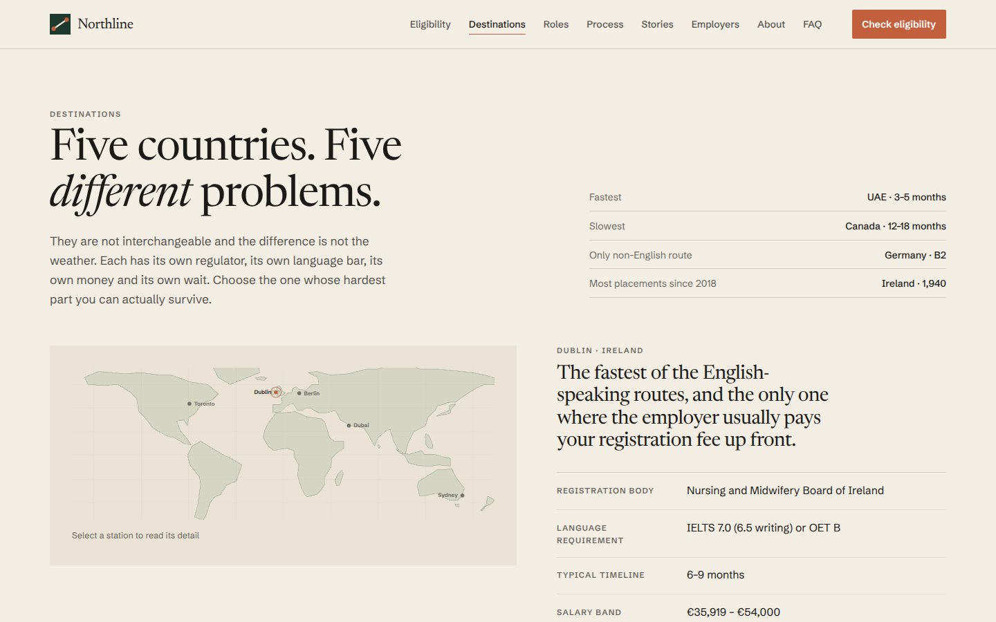
The whole site is organised around the distance between where you are and where you are going. The home page opens with two paths, candidate or employer, as plain text links. The route strip shows origins and destinations as stations on a line. Process is a timeline with real durations. Destinations are an explorer, not a brochure.
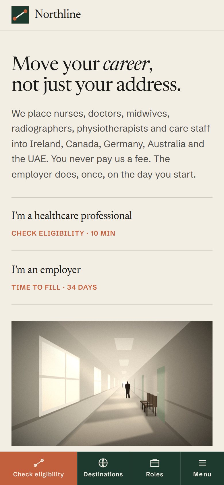
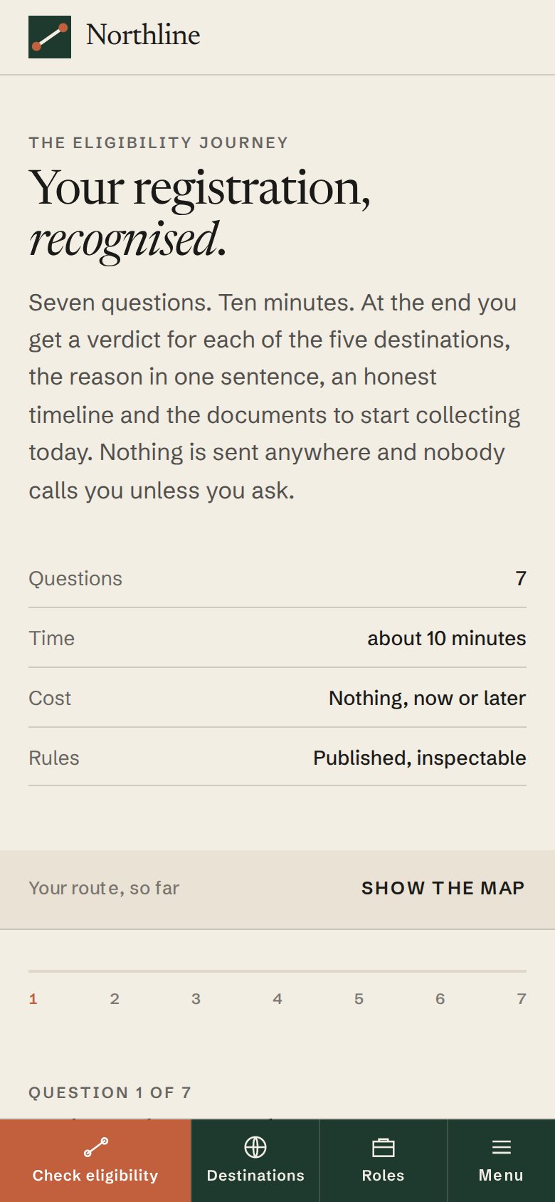
On mobile the primary action sits in a bottom bar within thumb reach, and the eligibility journey stacks question over map so that progress is always visible.
Seven questions that draw a map.
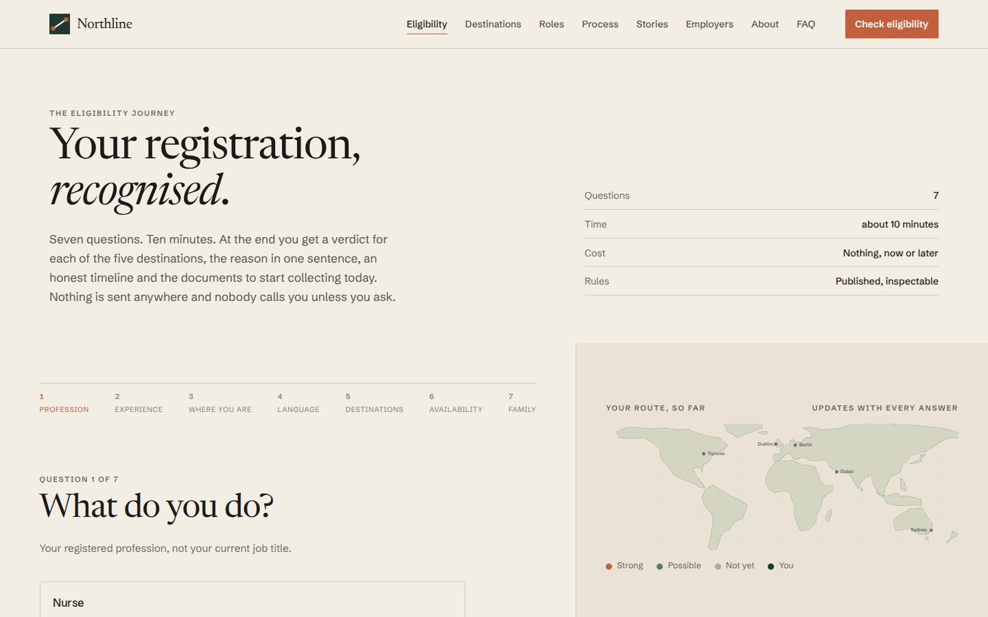
The eligibility journey asks seven things one at a time: profession, years registered, current country, English level, preferred destinations, availability and family. Each answer collapses into an editable summary line and updates a route map where destinations light or dim according to a rules module that anyone can read: Germany needs B2 German, care workers are not eligible for Canada’s Express Entry but are for Ireland and the UAE, doctors go to Ireland and Australia first.
The result is a personal pathway with a score per destination, a one-sentence reason, a drawn timeline, the documents to start gathering now, and a call booking that completes in-page. A small assistant with a local knowledge base answers the questions people actually ask.
 Open the live site
The eligibility journey with the route map
Purposeful, quick, reassuring.
Nothing on the site parallaxes. Route lines draw once as sections enter. Underlines draw on hover. Filters reorder rows with a FLIP transition so nothing appears from nowhere. Questions enter with a short rise over half a second, and progress is always visible so that motion communicates state rather than mood.
A rules engine you can read.
The eligibility logic is a data module of destination rules evaluated on every answer, so the result is deterministic and inspectable. The map is hand-drawn SVG with routes as stroked paths. Role filtering uses GSAP Flip for layout transitions. The assistant is a keyword-matched knowledge base of thirty answers in the brand’s voice; no external calls are made.
Desktop and mobile.
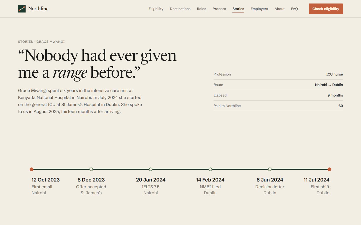
Screens captured from the built site at 1440 and 390 pixels wide.
 Open the live site
 Open the live site Open the live site
 Open the live site
 Open the live site
 Open the live site
Home · Home at 390 with the bottom bar · The eligibility journey with the route map · Destination explorer · Candidate story · Eligibility on mobile
Conversion design that respects the person converting.
The finished site proves that a conversion-led product can be warm, that trust can be built without a stock photo of a smiling nurse, and that the most persuasive thing a recruiter can do is tell the truth about the timeline.
