Quayside
Berth planning software for container terminals. No screenshots: a working planner sits above the fold and the site explains itself while you drag.
- Client
- Quayside B.V., Rotterdam
- Sector
- B2B software, maritime logistics
- Scope
- Site with live product, product tour, pricing calculator, customers, documentation, status, demo booking
- Year
- 2026
- Stack
- Vite · vanilla state model · SVG board · canvas tide curve
Talks in hours, metres and TEU.
Quayside was founded in Rotterdam in 2019 by a former ECT berth planner and a former Maersk engineer. Its product plans berths, tracks vessel timelines and manages port-call documentation for thirty-one terminals in fourteen countries, from Felixstowe to Tanjung Pelepas. Forty-six people; ISO 27001; a status page it is not embarrassed by.
The voice is technical and plain. It uses no adjectives it cannot measure.
Sell to people who are allergic to marketing.
Terminal operations managers and port agents do not read landing pages. They evaluate tools by using them. The brief was to let a prospect use the product before speaking to anyone, and to make the site look like an instrument rather than a SaaS template with a gradient and a grid of screenshots.
The conversion is a booked demo, but the credibility comes from a planner that actually detects conflicts.
Industrial, high-information, flat.
The site is dark because operations rooms are dark. Steel for the background, chart white for text, hazard orange used flat for selections, conflicts and the single button, tide teal for water and anything positive. There are no gradients and nothing glows.
IBM Plex Sans carries the interface, Plex Sans Condensed the column labels, Plex Mono every number. Panels are rectangles with one-pixel borders and square corners. Tables are first-class. The only photograph on the site is a rendered night still of a terminal, used once.
The product is the information architecture.
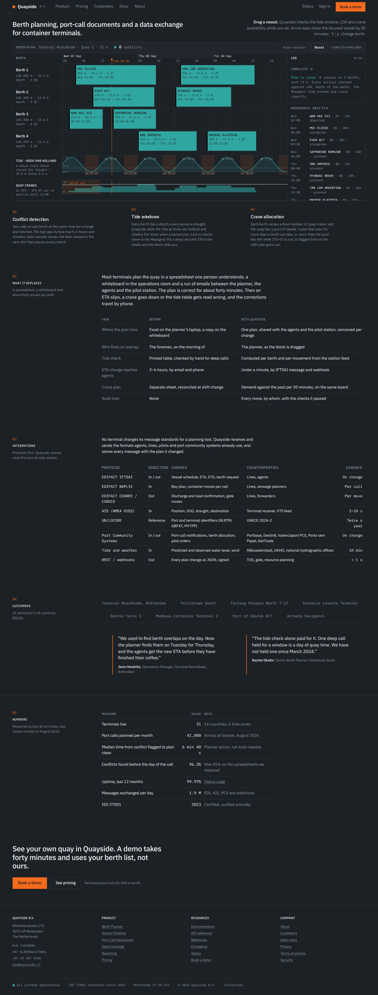
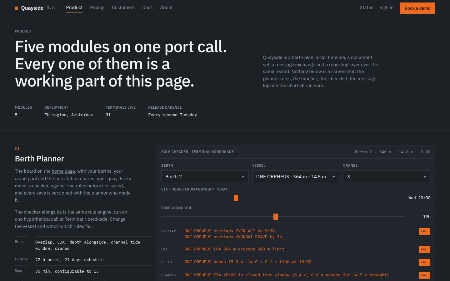
The home page opens on the planner with a one-line instruction. Beside it, three numbered explanations highlight the relevant part of the board on hover. What follows is what an operations manager actually asks: what it replaces, what it integrates with, who uses it, what it costs, whether it is up.
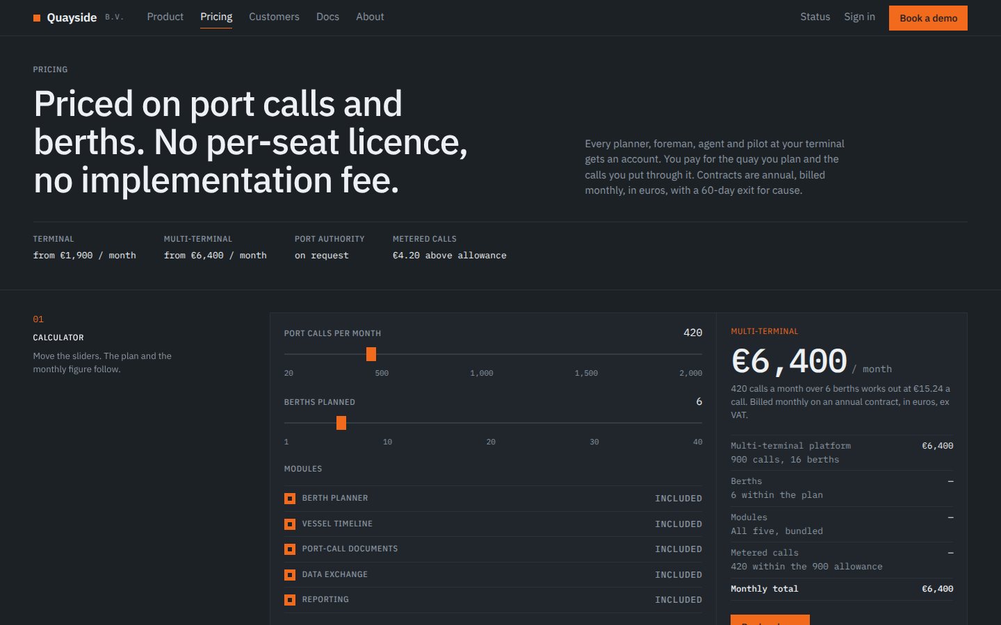
The product page demonstrates each module as a working mini-component rather than an image; pricing is a calculator with a live number; documentation reads like documentation.
A berth planner that works.
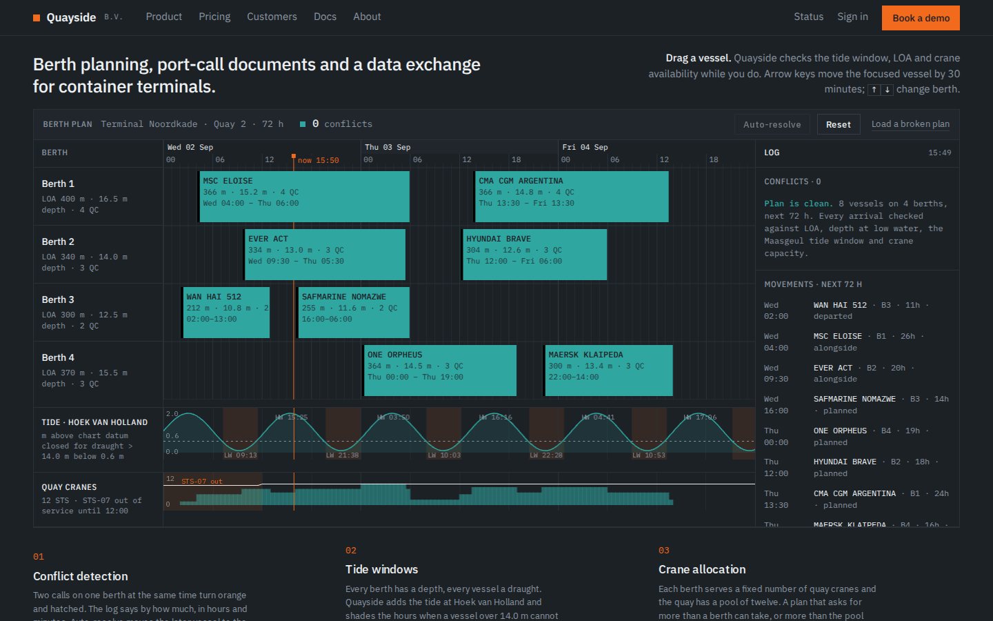
Four berths, each with a length limit, a depth and a crane count, against a seventy-two-hour axis with a real now line. Eight vessels sit on the board as blocks; drag one horizontally to change its time or vertically to change its berth, snapping to thirty minutes with live ETA and ETD.
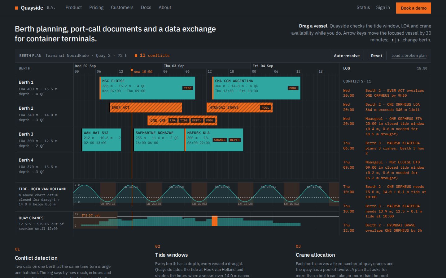
Overlaps on the same berth turn hazard orange with a hatch. A vessel longer than its berth, deeper than the tide window allows, or needing more cranes than are free raises a typed warning in a mono log. A counter tracks conflicts; auto-resolve shifts the offenders to the next valid slot with a short animated move. Arrow keys move the focused vessel. Beneath it all, a canvas tide curve with shaded restricted windows.
 Open the live site
A conflict raised and logged
Snappy, mechanical.
Everything moves in 150 to 300 milliseconds and snaps to a grid. A status change pulses once. Drag has no lag. There are no scroll-triggered reveals beyond a short fade for panels below the fold, because an instrument should not perform.
A small real application inside a marketing site.
The planner is a vanilla JavaScript state model with the vessels and berths in a data module and conflict detection run on every change. The board is SVG; the tide curve is canvas; keyboard and pointer share one mutation path. Pricing is computed from port calls, berths and modules. The mini-components on the product page are the same approach at smaller scale.
Desktop and mobile.
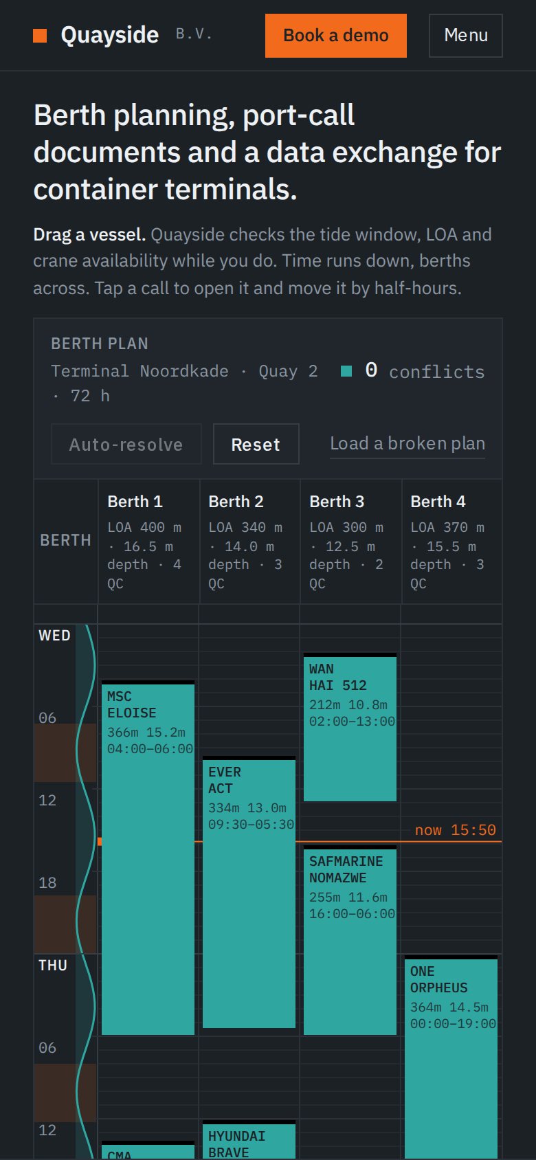
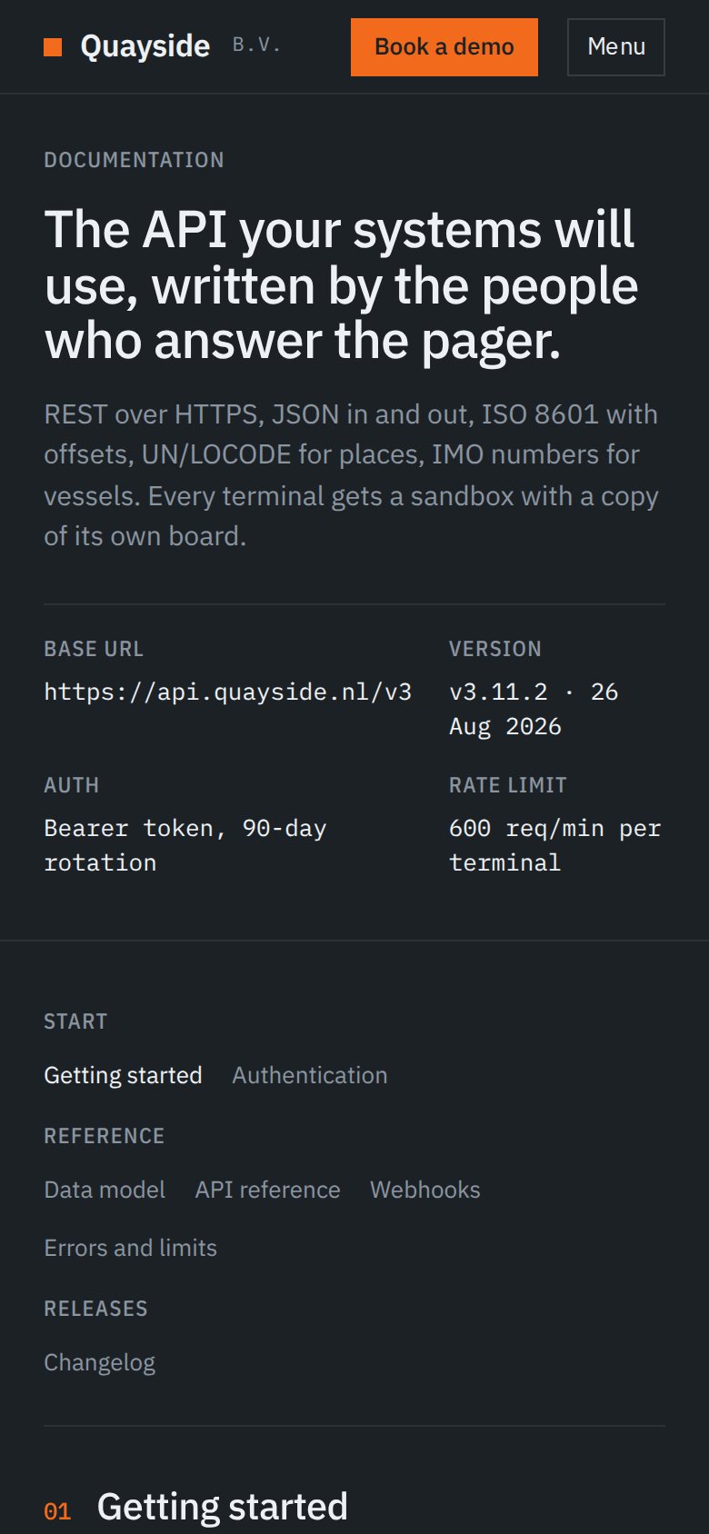
Screens captured from the built site at 1440 and 390 pixels wide.
 Open the live site
 Open the live site Open the live site
 Open the live site
 Open the live site
 Open the live site
Home: the planner above the fold · Planner at 390 · A conflict raised and logged · Product modules as working components · Pricing calculator · Docs on mobile
Product design and creative development in one piece.
The finished site shows what a B2B product can look like when the product itself is the argument. It looks nothing like a SaaS template because it is not pretending to be one.